
I wish there was a value to width and height of CSS which indicated that the element should use the rest of the space available within its parent element. Something like:
.parent {
        height: 100%;
        padding-top: 50px;
    }

    .parent .child {
        height: stretch;
    }
To my experience you more often want your element to stretch out on the remaining space of its parent, rather than use its full height/width. To explain this in more detail, think of the following scenario… which actually is a scenario in one of our projects.
We want an interface with modules. We want a fixed height on both the top bar and the bottom bar of the application. The middle section, containing the modules should “stretch” based on the height of the browser window.
So lets look at the problem step by step. I first insert three divs which represents the top, the content container for the modules and the bottom.
<div id="bar-top"></div>
    <div id="content-modules"></div>
    <div id="bar-bottom"></div>
Looking at the css we first set the html- and body element to height: 100% to stretch it to the height of the window in the browser. Then we set fixed heights for the top and bottom. Since there is no stretch value for height, we try to insert 100% on our content-modules element. The auto value only makes the height fit its content, which is not what we want.
html, body {
height: 100%;
margin: 0;
}
#bar-top, #bar-bottom {
height: 60px;
}
#content-modules {
height: 100%;
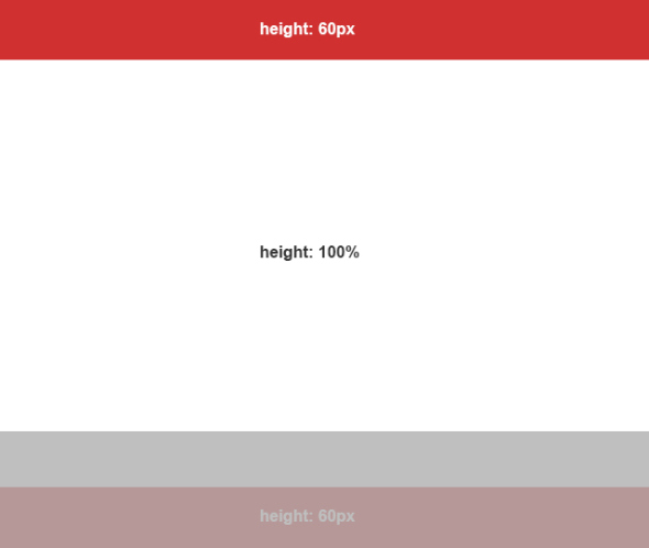
}What happens now is that the content-modules element will use the height of its parent. So in a scenario where the height of the body is 1000 pixels, the height of the content-modules element would also be 1000 pixels, causing the total height of the interface to be 1000 pixel + 60 pixels (bar-top) + 60 pixels (bar-bottom) = 1120 pixels. Your bottom element will now go outside the window of the browser.
To avoid this we have to think differently. There are probably multiple solutions to this, but this is how I think about it to avoid the problem. This is the mindset:
- Elements with child elements that are absolute, must be position: relative
- Define the available stretch-able space by using padding on the parent element
- Use box-sizing: border-box on the parent element to subtract the padding and border defined when child element sets height 100%. This will cause child elements to use the actual free space of the parent when using height: 100%
- All containers with a fixed height should be position: absolute and with top or bottom position defined
So lets see these principles in practice. First we define the CSS:
html, body {
height: 100%;
}
body {
position: relative; /* 1. Position relative because of absolute child elements */
padding: 60px 0 60px 0; /* 2. Using padding to define strech-able space */
box-sizing: border-box; /* 3. Box sizing to subtract padding and border from the 100% height of this element when child elements define 100% height */
}
#bar-top, #bar-bottom {
height: 60px;
position: absolute; /* 4. Setting fixed height elements to absolute */
width: 100%; /* When absolute a width has to be defined */
}
#bar-top {
top: 0; /* Position absolute top bar */
}
#bar-bottom {
bottom: 0; /* Position absolute bottom bar */
}
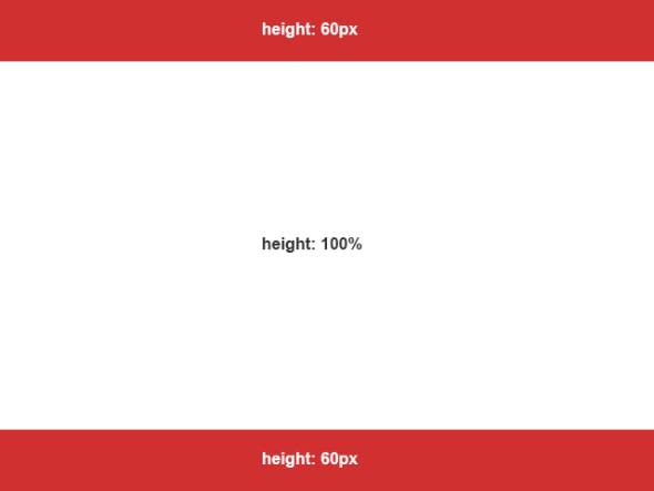
#content-modules {
height: 100%; /* 100% now refers to the remaining space of the parent after padding and borders are set */
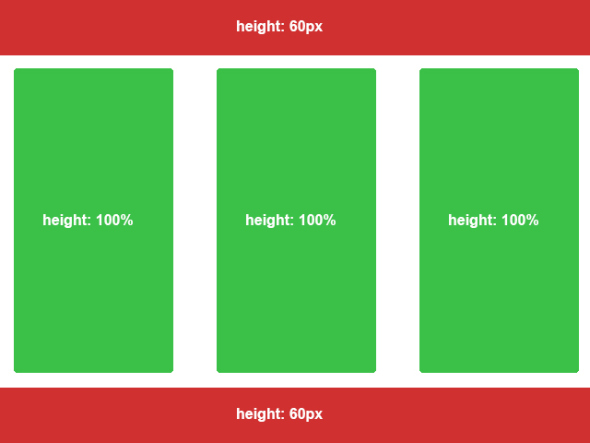
}This will leave us with the following result.
Lets add some modules.
<div id="bar-top"></div>
<div id="content-modules">
<div class="module"></div>
<div class="module"></div>
<div class="module"></div>
</div>
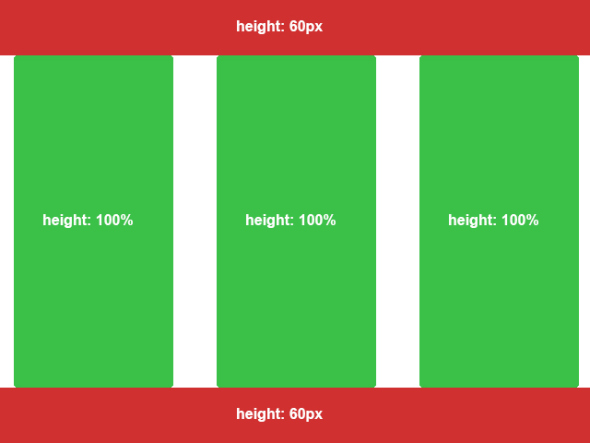
<div id="bar-bottom"></div>And the css, safely using 100% height:
.module {
        height: 100%;
        width: 250px;
        margin: 0 20px;
    }
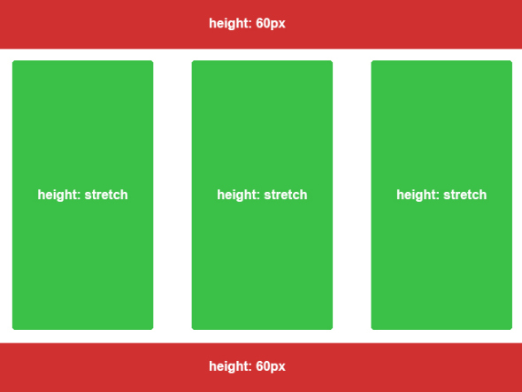
As we can see we are not quite there yet. The modules are attached to the top and bottom bar, we want some spacing between modules and the bars. You might think that margins are a good idea, but that will increase the total height of our modules. When using the concept explained here, tell yourself: “The stretch-area is defined by the padding of the parent”, so lets see what we can do there.
body {
        position: relative;
        padding: 70px 0 70px 0; /* Changed from 60px */
        box-sizing: border-box;
    }
By increasing the top and bottom padding by 10 pixels we have subtracted even more space available for the 100% of the childrens height, causing our content-modules element to have space between the top bar and the bottom bar. The children of the content-modules element can safely keep their height of 100% as they are relative to content-modules.
You can continue this exact process on each module itself if you want to define a stretch area on each module. F.ex. if every module should have a top-bar itself and the rest should be stretched, you can do the following:
.module {
        position: relative;
        padding-top: 30px;
        box-sizing: border-box;
        display: inline-block;
    }

    .module .bar-title {
        position: absolute;
        top: 0;
        height: 30px;
        width: 100%;
    }

    .module .module-content {
        height: 100%;
    }
And the html would be:
<div id="bar-top"></div>
    <div id="content-modules">
        <div class="module">
            <div class="bar-title"></div>
            <div class="module-content"></div>
        </div>
        <div class="module">
            <div class="bar-title"></div>
            <div class="module-content"></div>
        </div>
        <div class="module">
            <div class="bar-title"></div>
            <div class="module-content"></div>
        </div>
    </div>
    <div id="bar-bottom"></div>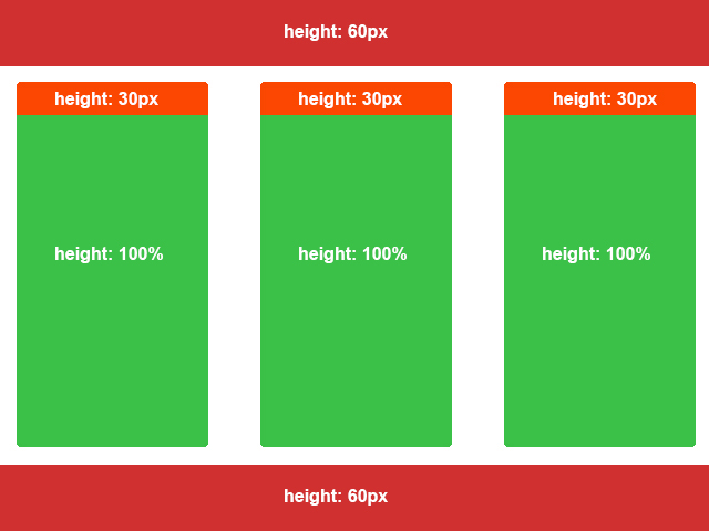
Here is a fiddle of it: HTTP://JSFIDDLE.NET/5XNMF/. Resize the height of your browser window and you will see that it stretches.